CSS三角形绘制方法,学会了这个,其它的也就简单。
我们的网页因为 CSS 而呈现千变万化的风格。这一看似简单的样式语言在使用中非常灵活,只要你发挥创意就能实现很多比人想象不到的效果。特别是随着 CSS3 的广泛使用,更多新奇的 CSS 作品涌现出来。 今天给大家带来 CSS 三角形绘制方法 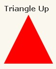
1 | #triangle-up { width: 0; height: 0; border-left: 50px solid transparent; border-right: 50px solid transparent; border-bottom: 100px solid red; } |
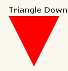
1 | #triangle-down { width: 0; height: 0; border-left: 50px solid transparent; border-right: 50px solid transparent; border-top: 100px solid red; } |
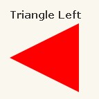
1 | #triangle-left { width: 0; height: 0; border-top: 50px solid transparent; border-right: 100px solid red; border-bottom: 50px solid transparent; } |
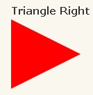
1 | #triangle-right { width: 0; height: 0; border-top: 50px solid transparent; border-left: 100px solid red; border-bottom: 50px solid transparent; } |

1 | #triangle-topleft { width: 0; height: 0; border-top: 100px solid red; border-right: 100px solid transparent; } |
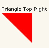
1 | #triangle-topright { width: 0; height: 0; border-top: 100px solid red; border-left: 100px solid transparent; } |
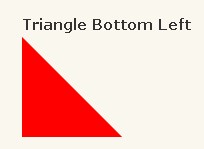
1 | #triangle-bottomleft { width: 0; height: 0; border-bottom: 100px solid red; border-right: 100px solid transparent; } |
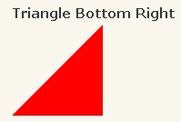
1 | #triangle-bottomright { width: 0; height: 0; border-bottom: 100px solid red; border-left: 100px solid transparent; } |